


Inside the Box serves as a forum for individuals involved in the production of Gearbox Software content to share personal motives, methods, process and results. Gearbox Software projects are created by a diverse range of individuals spanning a spectrum of different backgrounds, interests, objectives and world views. The views and opinions expressed in this article are those of the author and do not necessarily reflect the official policy or position of Gearbox Software or any of its individual members outside of the author.
Hi! I’m Jeffrey “botman” Broome, one of the programmers that worked on Borderlands 2. I’m back “Inside the Box” again to tell you about how an upcoming Borderlands 2 update will (among other things) bring a colorblind mode option to all platforms. Let’s talk a little a bit about what being colorblind is, what it isn’t, why some people are colorblind and other people aren’t and what can be done in video games to help compensate for colorblindness. Check it out and if you’re not careful, you might learn something.
Up until several months ago, I, like probably many of you, didn’t really know much at all about colorblindness. I knew a small percentage of people (mostly males) had it, but didn’t know much more beyond that. First of all, the word “colorblind” is not an accurate description. A better description would be “color vision deficiency”. Most people who are colorblind aren’t completely blind to colors, but rather they have a visual deficiency that makes it difficult to discern some colors from other colors. For example, green may look very similar to yellow or orange. So when people with color vision deficiency look at something green, they may think that it is actually orange. I found an interesting YouTube video called “No Such Thing As Color” that someone made that talks about what it’s like to be colorblind.
Color vision deficiency (or CVD for short) is almost always something that is inherited from your parents. On very rare occasions, it can be caused by trauma to the eye or to the brain, but almost everyone with CVD was born with it. There is no “cure” for CVD. People learn to live with it for their entire lives. Most people who are born with CVD don’t even realize they have it until they are older. In many cases, it is detected when children start primary school and a teacher notices a child using unusual color choices when drawing pictures.
Humans are trichromatic, which means they see all colors by using a combination of three basic colors, red, green and blue. The eye contains rods (used in low light conditions) and cones (used to detect colors). There are three types of cones in the human eye. There are cones that detect red light (called the L-cone because it detects long wavelength light). There are cones that detect green light (called the M-cone because it detects medium wavelength light). And there are cones that detect blue light (called the S-cone because it detects short wavelength light). When red, green and blue light is combined in various intensities we see all the different colors.
There are three recognized types of CVD. Deuteranomaly or deuteranopia (a red-green colorblindness) is the most common. 7% of males and 0.5% of females have it. Deuteranopes have either defective or missing M-cones, so they have problems seeing green. Protanomaly or protanopia (a different red-green colorblindness) is more rare. 2% of males and 0.05% of females have it. Protanopes have either defective or missing L-cones, so they have problems seeing red. Tritanomaly or tritanopia (commonly referred to as blue-yellow colorblindness) is the most rare. Less than 1% of people have it. Tritanopes have either missing or defective S-cones, so they have problems seeing blue. The difference between the “nomaly” type and the “nopia” type is that in the “nomaly” case, the cone is present but not functioning properly. In the “nopia” case, the cone is completely missing. People who are of the “nomaly” type may be only partially colorblind. They may be able to detect more intense shades of a color, but have difficulty when the color is less saturated.
Colorblind gamers
Okay, so now you have a basic understanding of what colorblindness or CVD is, but how does this affect what someone sees when playing a video game? The biggest problem for colorblind gamers is when games use colors (and nothing else) to indicate a type of item, or the importance of an item, in the game. For example, some multi-player games use red for one team color and green for the other team color. This makes it very difficult for someone who is red-green colorblind to determine who is on what team because they both look the same (or very similar). If you have a game where you are supposed to match up tiles of the same color, you may make mistakes and try to match up green tiles with yellow tiles if you are colorblind. Borderlands 2 has similar issues with the color that is used to indicate the rarity of an item on the “loot beam” that appears in the world above the item and on the color of the item card used to display the stats of that item. So it is difficult to tell which items are the good items and which items are the not-so good items.
But, if you are not colorblind (like me), how can you determine whether your game will have issues for people who are colorblind? There are some websites that have tools that allow you to take a picture or screenshot and modify the colors to simulate what a person with CVD would see. Vischeck.com and Daltonize.org have links to such tools. Here is an image showing the loot colors used in Borderlands 2 displaying what someone with normal vision would see along with colorblind simulations of the same colors as they would appear to someone with deuteranopia, protanopia, and tritanopia.
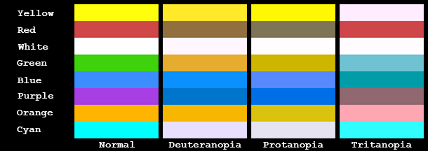
Note that for deuteranopes, green and orange appear as the same color (or very similar), so it’s hard to tell these apart. Also note that cyan (used for pearlescents in the game) looks very similar to white. Protanopes have the same issues. Note that for tritanopes, yellow and white look very similar and green and blue can look very similar as well. So what can we do to help people with CVD be able to identify items more easily?
What can be done to help?
One of the ways that some games help colorblind gamers is by swapping out one of the colors on an item for a different color to make it easier to distinguish between these items. For example, instead of using a red team and a green team maybe use a red team and a blue team. An alternative used by some games is to use a technique to modify all colors slightly to try to make them easier to distinguish. This technique is often referred to as “Daltonization” named after John Dalton who did early research on colorblindness. The Vischeck website has a page that shows examples of this technique. Notice the red and green fruit on the sitting man’s left. In the colorblind simulation, both of these look brown. Scroll down to the bottom of the page and notice that in the Daltonized simulated image (number 4), the red and green fruit now appear as gray and brown, so you can distinguish between them. Daltonization can be useful if you don’t want to make custom changes to each specific color, but if you only have a few colors to deal with, you can usually get better results by manually choosing other colors that are more distinct for people with CVD.
When modifying the loot beam colors in Borderlands 2, one of the things that I had to keep in mind was that the game supports playing in split-screen mode. It would probably be unlikely that both players in split-screen mode would be colorblind, so I wanted to try to keep any modified colors as close as I could to the original color so that players who aren’t colorblind wouldn’t have trouble recognizing a color of an item (for example, I wouldn’t want to change something from green to pink). This is necessary because each screen in a split-screen game doesn’t have its own copy of an item in the world. There is only one item in the world and there are 2 separate cameras (one for each player) that may be viewing that item at the same time. So the item only has one color that both players see at the same time. If we had implemented a colorblind mode before the game shipped, we could have modified things so that each screen in split-screen mode was able to display separate colors, but this was impossible to do once the game had shipped.
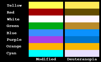
Below is an image showing the modified loot beam colors in the game when ‘deuteranopia’ colorblind mode is enabled along with the colorblind simulation of what someone with deuteranopia would see. You can compare the deuteranopia colorblind simulation in the image below to the deuteranopia portion of the image above and notice that it is now much easier to distinguish between green and orange. Red was also changed so that it wouldn’t be confused with the new modified green color.
We do similar changes to other colors for protanopia and tritanopia when they are selected as the colorblind mode.
Adding more information can help as well
Modifying the colors used for items isn’t the only thing that can be done to help compensate for CVD. You can also add text or graphical elements to something to make each item be more distinct. For example, in the tile matching game mentioned above, in addition to changing the color of some of the tiles, you can also add a symbol to each tile to make it more recognizable. For example, if you had 5 different colored tiles, you might add a little symbol in the corner of each tile. Maybe use a plus sign, a circle, a square, a triangle and a star for each of the 5 colors. This way you can match them using the color and the symbol.
For Borderlands 2, it would be difficult to add anything to the existing loot beam displayed in the world since it’s not easy to modify the existing particle effects after the game has shipped. But we can add text to the item card to display the color of the item when you get close enough to see the item card with the stats on it. I chose to use the name of the color (“green”, “blue”, “orange”) rather than the rarity name (“uncommon”, “rare”, “legendary”, etc.) because not everyone would know what color corresponds to “uncommon” or “very rare” and because there is already a loading screen tip that tells you the order of the colors (white, green, blue, purple and orange).
Here are some examples of what the item cards would look like when colorblind mode is enabled.

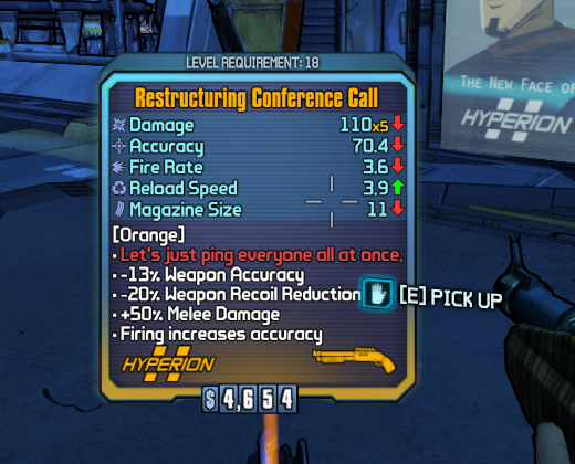
The name of the color of the item can be found in the lower part of the item card below the stats. It will always be the first line of text and will be enclosed in square brackets (like “[Green]” or “[Orange]”) and it is only shown when colorblind mode is enabled. All items (weapons, shields, grenade mods, class mods, relics, etc.) will have this line of text when colorblind mode is enabled. The color name in the item card will appear on items that are dropped in the world, on items that are found in a chest or in a vending machine, and will appear on items when you are examining them in your inventory.
Once the update is released (more on that in the near future), you’ll be able to find Colorblind mode in Video Options menu at the very bottom. You can select from the three types of color vision deficiency (Deuteranopia, Protanopia, or Tritanopia) or select “Off” to turn colorblind mode off. If you aren’t sure which type of color vision deficiency you have, you can just try them out one by one until you find the one that works best for you.
As a final note, when I was writing up this article and preparing the images above, I noticed that there is actually a bug when the colorblind mode is set to ‘protanopia’. When I was making changes to the code to modify the color red, I copied and pasted the wrong color values which caused red and green to show up as very similar for protanopes. This bug was detected too late to change it in the update so it will have to be fixed in a future update (it can’t be “hot fixed”). For now, people with protanomaly or protanopia should just use the ‘deuteranopia’ colorblind setting instead.
Additional references on colorblindness
//en.wikipedia.org/wiki/Colorblind
//www.color-blindness.com/
//www.colororacle.org/
//www.colourblindawareness.org/
//www.includification.com/vision/item/color-blind-options